I never liked the 'Wish' logo. I think is an incredibly clever design, but it's a bit, I don't know, unclear. And they look like some kind of leeches or slugs to me. Also, I don't like the fact that they discarded the "THE". They discarded it for obvious reasons, but still don't like it.
Well, I don't really like 'Wish' cover as a whole, I think is one of the worse. I like the red part with the doodles, but that blue circle with the clouds (or whatever it is) is terrible. It just don't match.
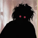
If you look at the drawing from a distance, it makes me think a lot about an egg and sperm (Sorry, do we say that in English ?) It's purely biological, it isn't chastened language haha ! Next, I will think of hands and earth... Or, it doesn't mean anything at all. In fact, we can have several interpretations. I like him, but I can understand that you don't.
I like the logo of 1996. Almost right but not quite, one has the impression that all the letters move. I think it's pretty well thought out.
I never liked the 'Wish' logo. I think is an incredibly clever design, but it's a bit, I don't know, unclear. And they look like some kind of leeches or slugs to me. Also, I don't like the fact that they discarded the "THE". They discarded it for obvious reasons, but still don't like it.
Well, I don't really like 'Wish' cover as a whole, I think is one of the worse. I like the red part with the doodles, but that blue circle with the clouds (or whatever it is) is terrible. It just don't match.
If you look at the drawing from a distance, it makes me think a lot about an egg and sperm (Sorry, do we say that in English ?) It's purely biological, it isn't chastened language haha ! Next, I will think of hands and earth... Or, it doesn't mean anything at all. In fact, we can have several interpretations. I like him, but I can understand that you don't.
I like the logo of 1996. Almost right but not quite, one has the impression that all the letters move. I think it's pretty well thought out.
all of them!!! when i see a new logo or a new cover or even a new poster just like the 2016 or the Apollo 2014 i see elements... those elements are like toys to play with it.. so that give me choices to do boot covers
all of them!!! when i see a new logo or a new cover or even a new poster just like the 2016 or the Apollo 2014 i see elements... those elements are like toys to play with it.. so that give me choices to do boot covers
I do look forward to the new logos like my birthday!
I can't wait to see what the next new one will look like, seems they have had this one for awhile now.